People You Should Check Out
How Do I Find a Date Online?
Project Goals
1. Thorough data mining study of historical dating data: Understanding of supply & demand among different user groups and the importance of different user features for user popularity.
2. Improve person recommendation system: The basic goal of the recommendation engine is to maximize the utility of the user using the application, while also keeping in mind the utility of the people that are recommended. Construction and training of a 'Like' function for all pairs of people, and an improved retrieval list for a query user based upon maximizing utility for the global system as well as the query user.
Our overall goal is to better understand user behavior and provide an improved recommendation system.
Example Results
Data Mining Study
When Alice is looking for dates, she can add Bob into her hotlist if she thinks that Bob is hot. Presumably Bob's profile will be checked more frequently by Alice, and Bob will receive more messages from Alice. This is indeed the case when we average the activities of all users. But if Alice is extremely active, say sending more than 10,000 messages within 3 months, will the above assumption apply to her as well?
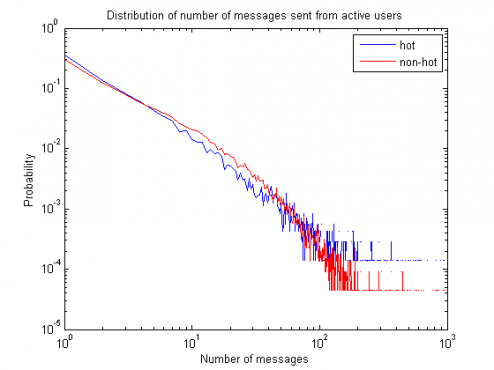

The above figures are the distribution of profile checks and messages sent from active users. Notice that while profiles are still more likely to be checked for users in the hotlist, there is no significant difference for the number of messages sent whether a user is in the hotlist or not. Therefore, when we are recommending new users to active users, hotlist might not be a good attribute to be considered compared to normal users.
How does geo-distance influence the number of messages sent? We first look at how the distance between a pair of users is distributed in our data:
How does geo-distance influence the number of messages sent? We first look at how the distance between a pair of users is distributed in our data:
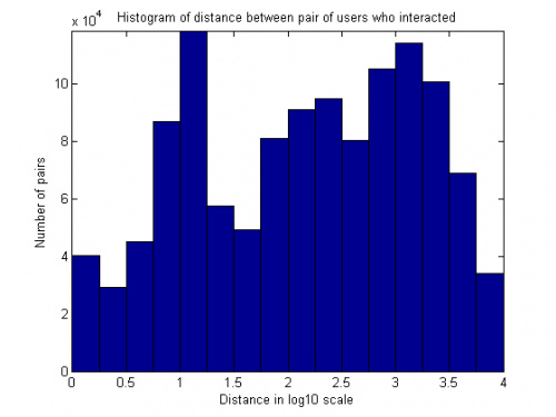
Note that there are two modes in this distribution, one centered around 10 miles, and the other around 1000 miles. If we now consider the number of messages sent as well, how will the distribution change as the number of messages varies?
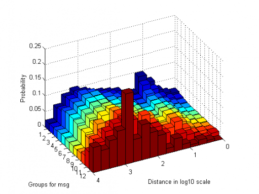
The above figure bins user pairs into groups, where group i contains messages between 10^((i-1)/4) and 10^(i/4). For example, group 1 collects user pairs with 1 message, and group 9 collects user pairs with messages between 100 to 177. In other words, more messages are sent in groups with higher indices. Here the probabilities are averaged over the same group, which means that when the number of messages are exceeding 562, more than 20% of the pairs are at the distance roughly below 1000 miles. We can see that as the number of messages increase, people move from closer targets to farther ones. Since only active users will send more than 100 messages to another user, it suggests that the "optimal" distance for active users is farther than normal users.
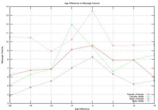
The graph above plots age difference versus message volume for different gender pairs, where age difference is defined as age of initial receiver minus age of initial sender. A negative age difference indicates that the individual who initiated the relationship is older. The Y axis message volume is the average number of net messages between any pairs of people with an age difference in the age bucket. Data is binned along the x axis, while the Y axis is averaged. The Female->Male curve indicates the average number of messages between a female and male where the female initiates the relationship.
Looking at the male -> female curve, we see that the area under the left hand side of the curve is greater than the area under the right hand side of the curve, indicating that on average, the relationship between men and younger women is strongest.
If we look at the female -> male curve, we see a greater preference for younger men, note the green peak at an age difference of -5. This indicates that women who initiate conversations on Skout are more likely to be "cougars," older women who seek younger men. We believe this is due to two things: 1) women who initiate conversations are more likely to be older women 2) women who are more active on online hookup applications are cougars. Note that in the green line above, there is at least one order magnitude more data points on the far left, than on the far right.
Looking at the male -> male curve, the main thing to notice is that the curve is on average higher than all other curves, indicating greater average activity (and receptiveness) among pairs of users in the gay community.
Looking at the female -> female curve, we see that it is the flattest curve among the four genders, which may be an indication that lesbians are the most open (least selective) among the four gender groups. This may be due to the fact that the lesbian population is comparatively small, so lesbians must be more open in their search for partners.
